Star Coffee Writing about stuff, working in public
Aviation Incident Visualizations
By Michal Jagodzinski - May 1st, 2023

Photo by Marek Piwnicki
Welcome back to Star Coffee! Super quick post today. I've been getting back into data visualization (as can be seen with my last post), and I stumbled on a good dataset from the Aviation Safety Network. So I decided to use this dataset to practice my data visualization skills some more.
I hope you enjoy these visualizations, and hopefully you learn some new tricks to implement for your own work.
First Visualization
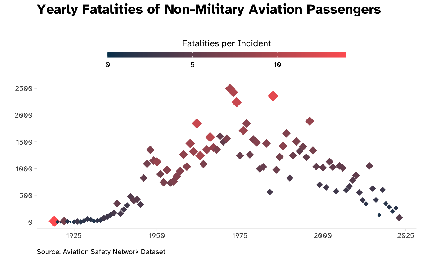
Data wrangling:
data <- raw_data %>%
  mutate(
    fatalities = as.integer(fatalities),
    year = as.integer(year),
    operator = as.factor(operator)
  )

fig1_data <- data %>%
  filter(!str_detect(operator, "AF|Air Force|Navy")) %>%
  group_by(year) %>%
  summarize(
    total_accidents = n(),
    total_fatalities = sum(fatalities, na.rm = TRUE)
  ) %>%
  mutate(fatalities_per_accident = total_fatalities/total_accidents) %>%
  drop_na
Visualization code:
ggplot(data=fig1_data, aes(x=year, y=total_fatalities)) +
  geom_point(aes(size=fatalities_per_accident,colour=fatalities_per_accident), shape=18) +
  scale_colour_gradientn(
    colours=c("#003f5c", "#ff6361"),
  ) +
 guides(
  color=guide_colorbar(
    title.position = "top",
    title.hjust = .5,
    barwidth=unit(20, "lines"),
    barheight=unit(.5, "lines"),
  ), size="none")+
  labs(
    x="",
    y="",
    title="Yearly Fatalities of Non-Military Aviation Passengers",
    subtitle = "",
    colour="Fatalities per Incident",
    caption="Source: Aviation Safety Network Dataset",
  ) +
  coord_cartesian(clip="off") +
  theme_minimal() +
  theme(
    legend.position = "top",
    text = element_text(family="Atkinson Hyperlegible"),
    panel.grid = element_blank(),
    axis.line = element_line(colour = "lightgrey", linewidth = 0.25),
    axis.ticks = element_line(colour = "lightgrey", linewidth = 0.25),
    plot.title=ggtext::element_textbox_simple(
      size=rel(1.5), face="bold",
      margin = margin(0, 0, 0.5, 0, "lines")
    ),
    plot.caption=ggtext::element_textbox_simple(halign=0)
  )
Second Visualization
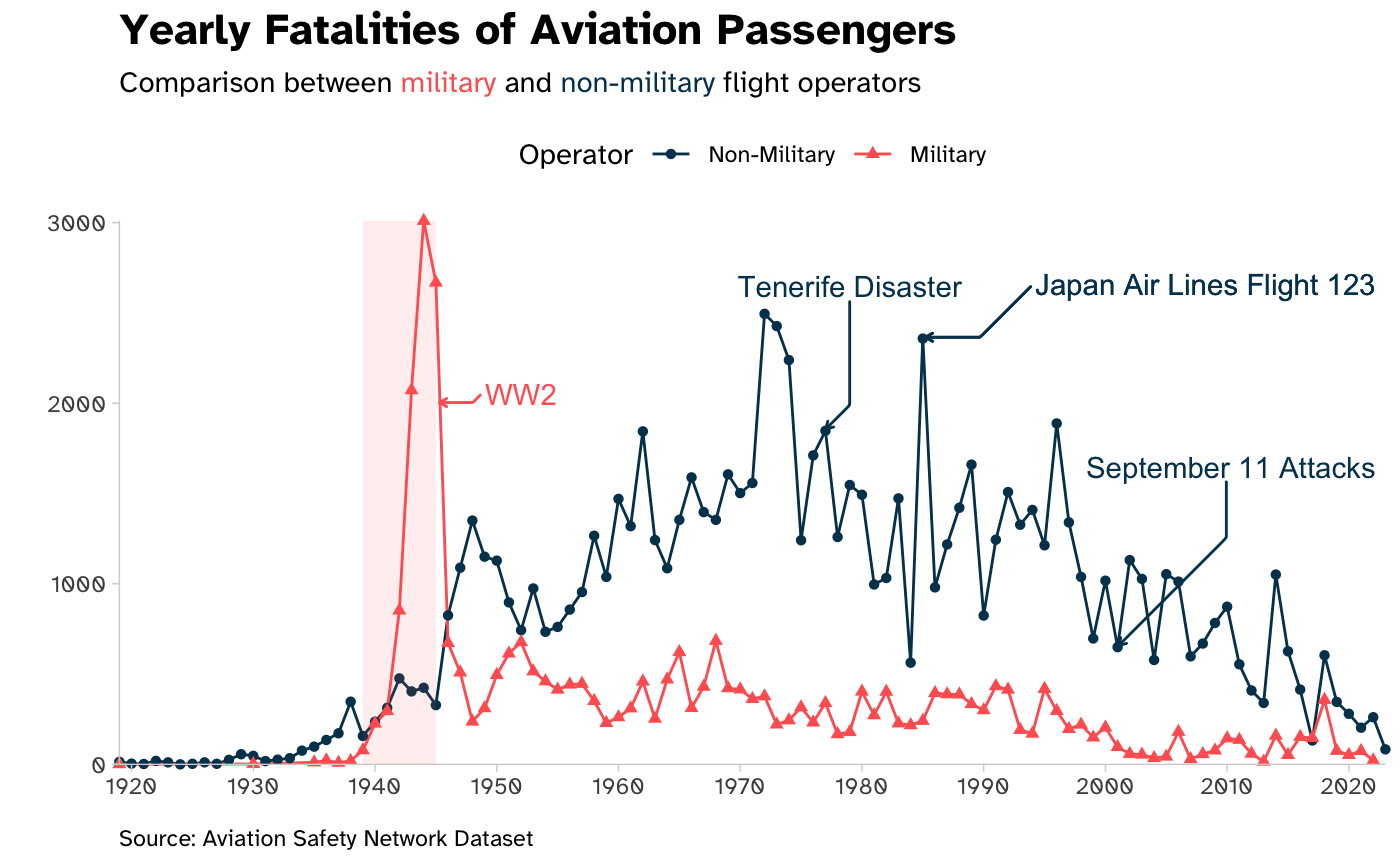
Data wrangling:
fig2_data <- data %>%
  mutate(operator = case_when(
    str_detect(operator, "AF|Air Force|Navy") ~ "Military",
    TRUE ~ "Non-Military"
  )) %>%
  mutate(operator = factor(operator, levels=c("Non-Military", "Military"))) %>%
  group_by(year, military) %>%
  summarize(
    total_incidents = n(),
    total_fatalities = sum(fatalities, na.rm = TRUE),
    .groups = "keep"
  ) %>%
  mutate(fatalities_per_accident = total_fatalities/total_incidents) %>%
  drop_na
Visualization code:
regions <- tibble(x1=1939, x2=1945, y1=-Inf, y2=+Inf)

ggplot(data=fig2_data, aes(x=year, y=total_fatalities, group=operator, colour=operator)) +
  geom_line() +
  geom_point(aes(shape=operator)) +
  labs(
    x="",
    y="",
    title="Yearly Fatalities of Aviation Passengers",
    subtitle = paste0("Comparison between <span style='color:", "#ff6361", "'>military</span> and <span style='color:", "#003f5c", "'>non-military</span> flight operators"),
    caption="Source: Aviation Safety Network Dataset",
    colour="Operator",
    shape="Operator"
  ) +
  coord_cartesian(expand=FALSE, clip="off") +
  theme_minimal() +
  theme(
    legend.position = "top",
    text = element_text(family="Atkinson Hyperlegible"),
    panel.grid = element_blank(),
    axis.line = element_line(colour = "lightgrey", linewidth = 0.25),
    axis.ticks = element_line(colour = "lightgrey", linewidth = 0.25),
    plot.title=ggtext::element_textbox_simple(
      size=rel(1.5), face="bold",
      margin = margin(0, 0, 0.5, 0, "lines")
    ),
    plot.subtitle=ggtext::element_textbox_simple(margin = margin(0, 0, 0.5, 0, "lines")),
    plot.caption=ggtext::element_textbox_simple(halign=0)
  ) +
  scale_x_continuous(breaks = scales::pretty_breaks(n = 10)) +
  scale_colour_manual(values=c("#003f5c", "#ff6361")) +
  geom_rect(
    data=regions, inherit.aes=FALSE,
    mapping=aes(xmin=x1, xmax=x2, ymin=y1, ymax=y2),
    color="transparent", fill="#ff6361", alpha=.1
  ) +
  ggrepel::geom_text_repel(
    data = tibble(x=1945, y=2000),
    aes(x=x, y=y), label = "WW2", colour="#ff6361", inherit.aes = FALSE,
    nudge_x = 7,
    nudge_y = 50,
    segment.curvature = -1e-20,
    arrow = arrow(length = unit(0.015, "npc")),
    min.segment.length = 0
  ) +
  ggrepel::geom_text_repel(
    data = tibble(x=2001, y=649),
    aes(x=x, y=y), label = "September 11 Attacks", colour="#003f5c", inherit.aes = FALSE,
    nudge_x = 15,
    nudge_y = 1000,
    segment.curvature = -1e-20,
    arrow = arrow(length = unit(0.015, "npc")),
    min.segment.length = 0
  ) +
  ggrepel::geom_text_repel(
    data = tibble(x=1977, y=1847),
    aes(x=x, y=y), label = "Tenerife Disaster", colour="#003f5c", inherit.aes = FALSE,
    nudge_x = 2,
    nudge_y = 800,
    segment.curvature = -1e-20,
    arrow = arrow(length = unit(0.015, "npc")),
    min.segment.length = 0
  ) +
  ggrepel::geom_text_repel(
    data = tibble(x=1985, y=2358),
    aes(x=x, y=y), label = "Japan Air Lines Flight 123", colour="#003f5c", inherit.aes = FALSE,
    nudge_x = 30,
    nudge_y = 300,
    segment.curvature = -1e-20,
    arrow = arrow(length = unit(0.015, "npc")),
    min.segment.length = 0
  )
CC BY-SA 4.0 Michal Jagodzinski. Last modified: May 09, 2024.
Website built with Franklin.jl and the Julia programming language.
Website built with Franklin.jl and the Julia programming language.